Simplifying use
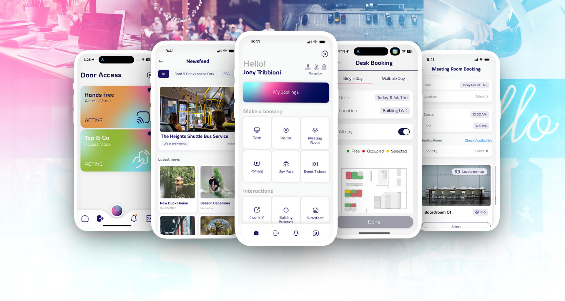
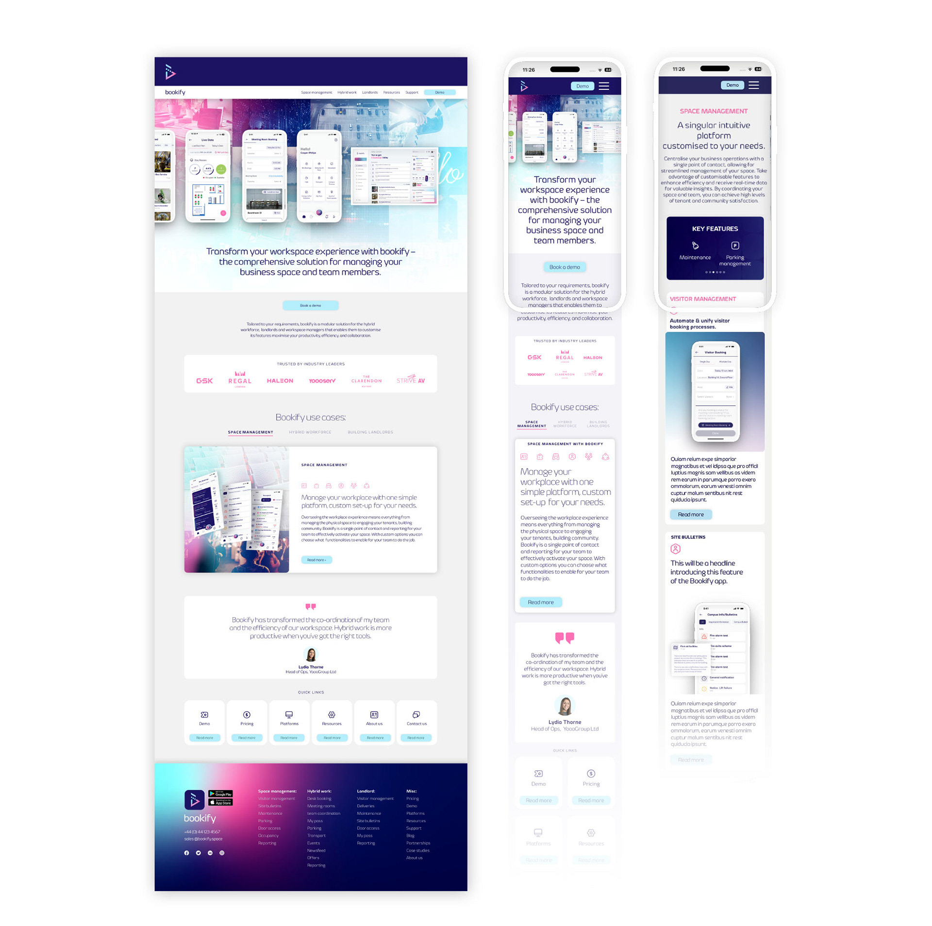
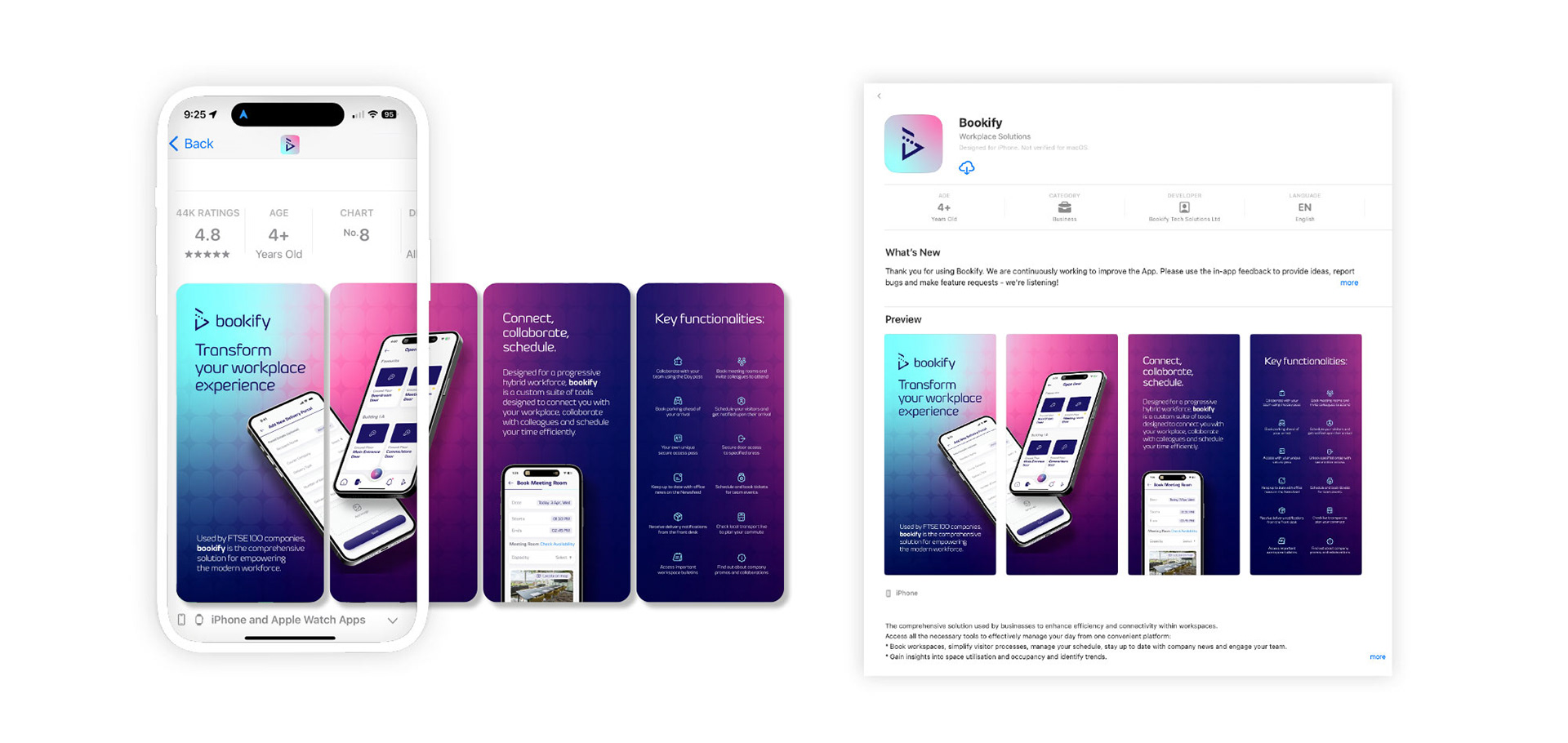
Working with UI freelancers and developers I devised a simple, easy to use interface and a website that simplifies and rationalises in an over complicated market.
Extending the UI across hardware
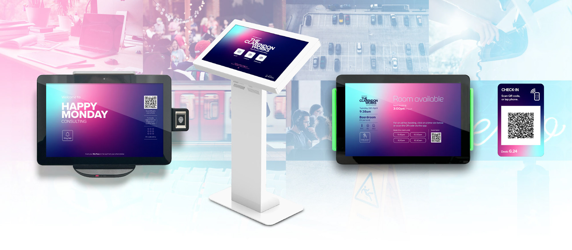
The UI experience had to be rationalised across web, app and hardware to ensure a consistent user experience from back end to end user.
Sales and support materials
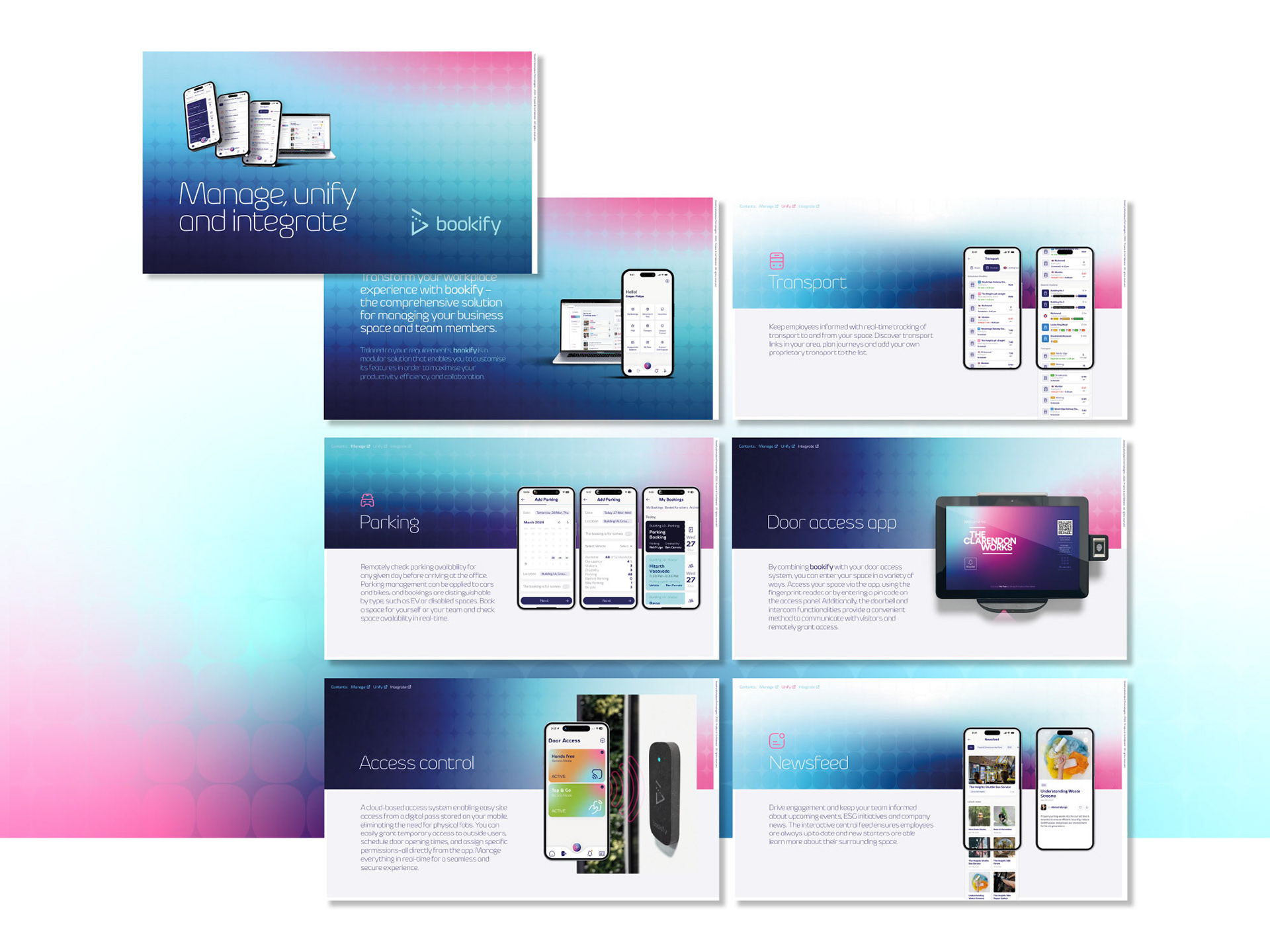
Interactive pdf materials were designed for sales and end users for all three target markets.