Starting with a name and a grey business park location, I designed this brand and all touch points for this ambitious cafe chain. Crafted to bring some colour and joy to a space where the meal deal walk of shame was the norm, this brand has become popular and iconic in a short space of time. The brand uses the visual language of conversation and coffee as well as a fresh and wholesome colour palette.
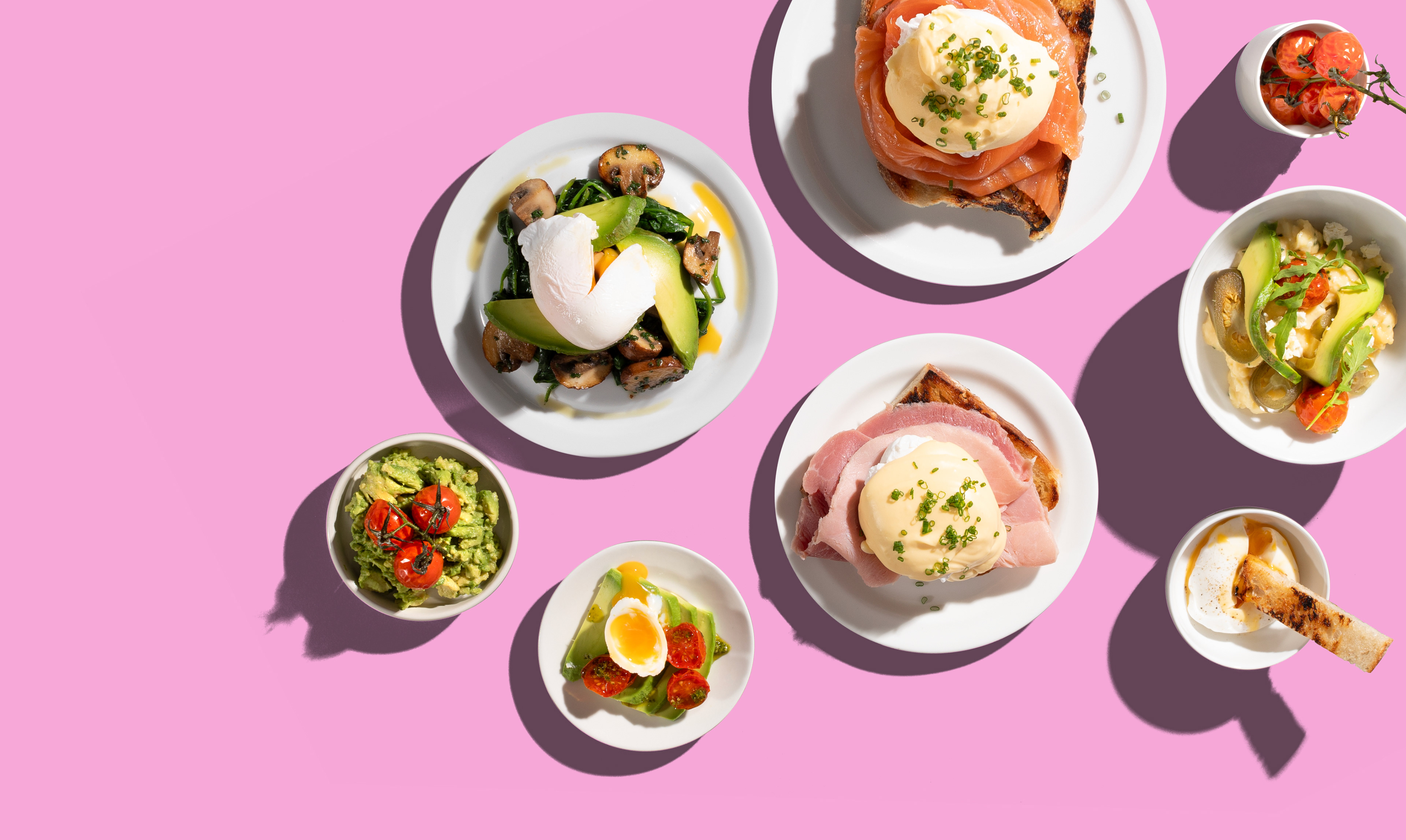
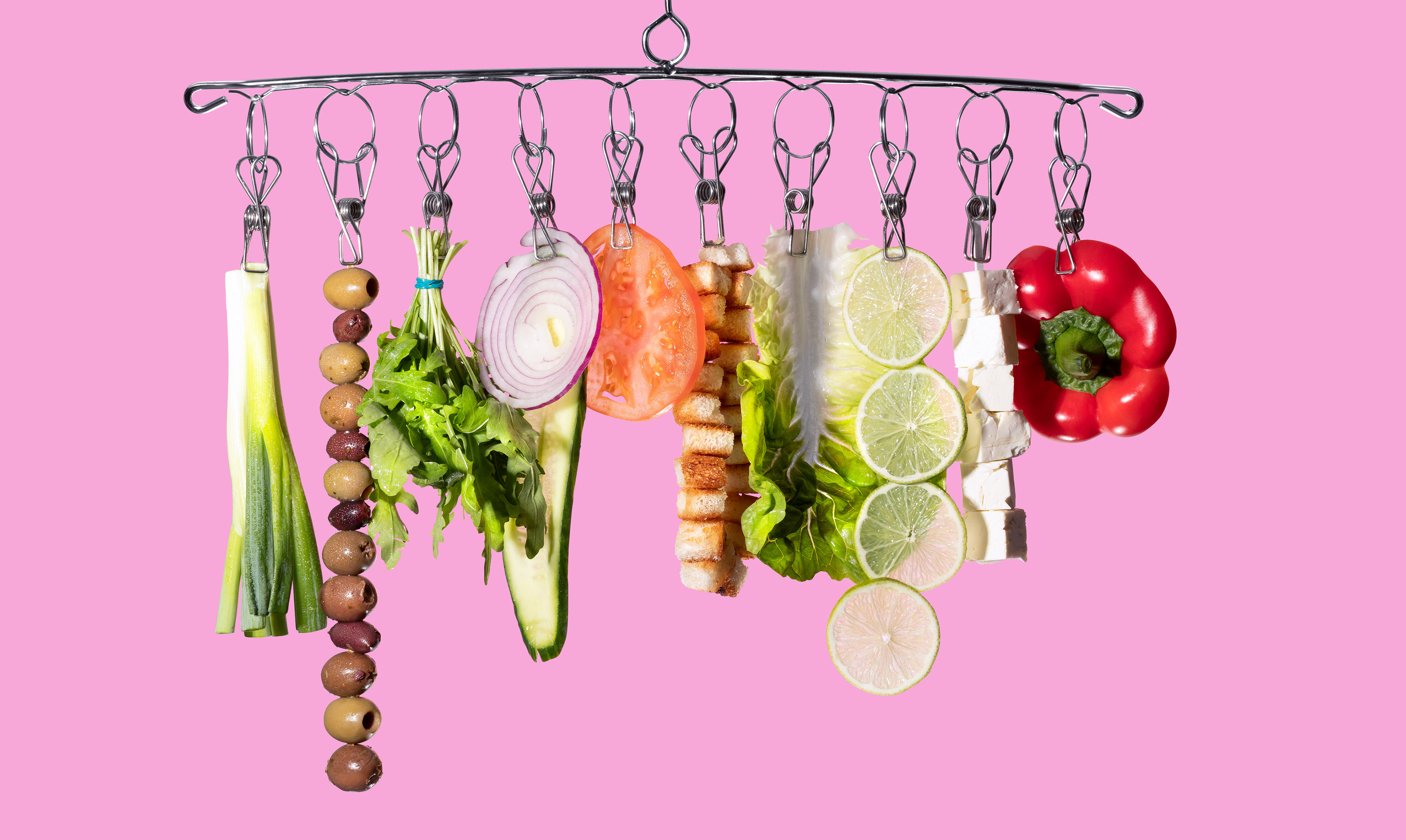
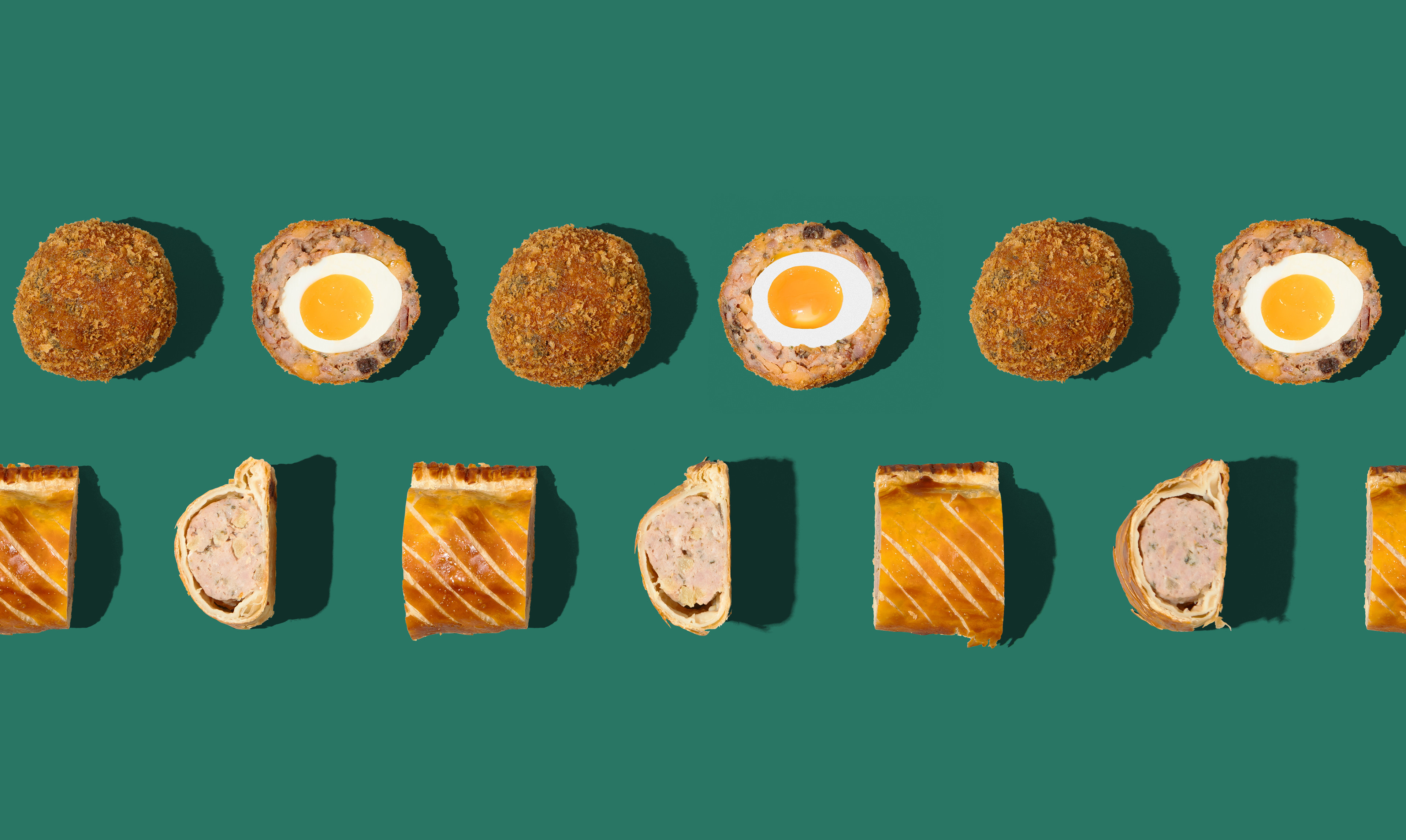
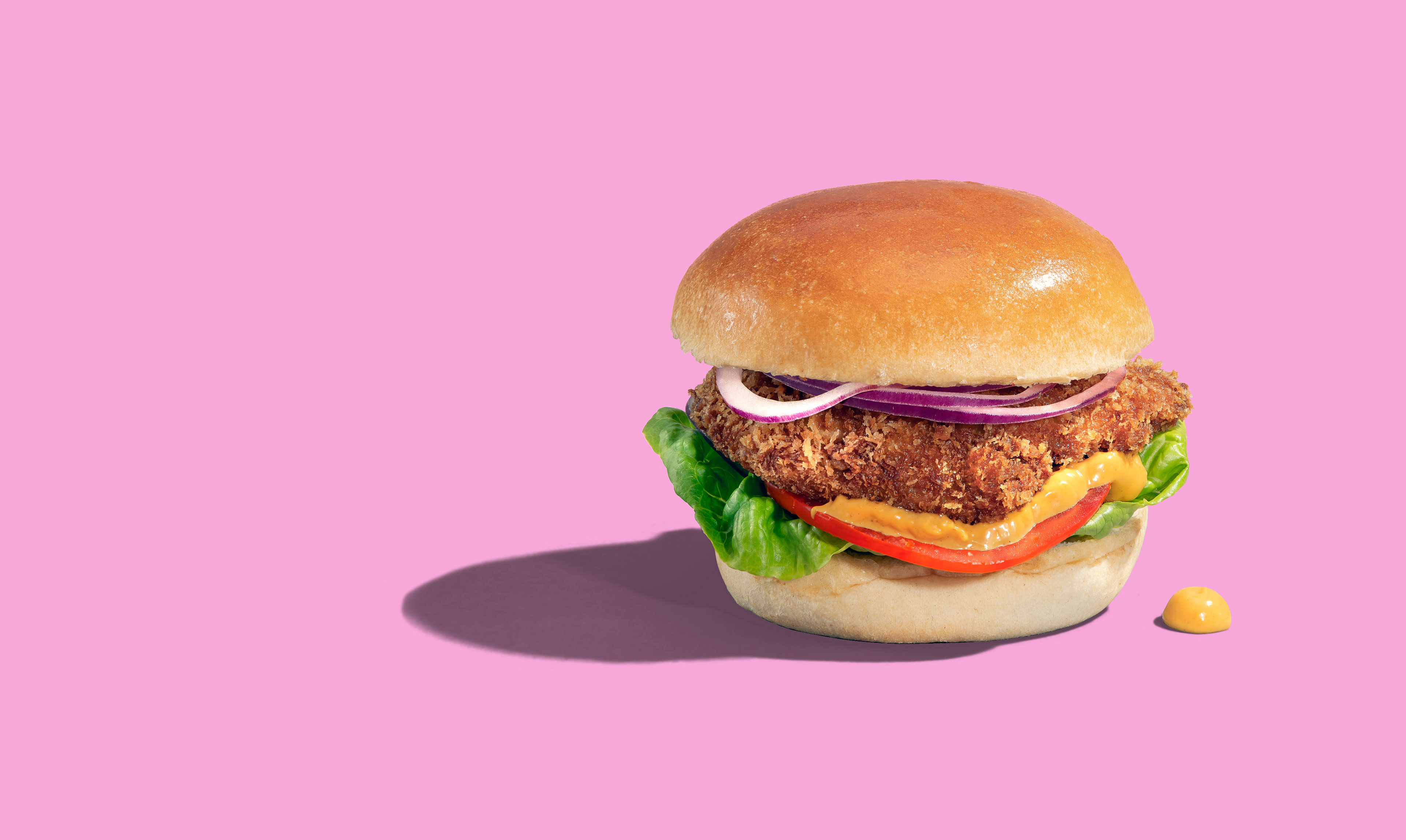
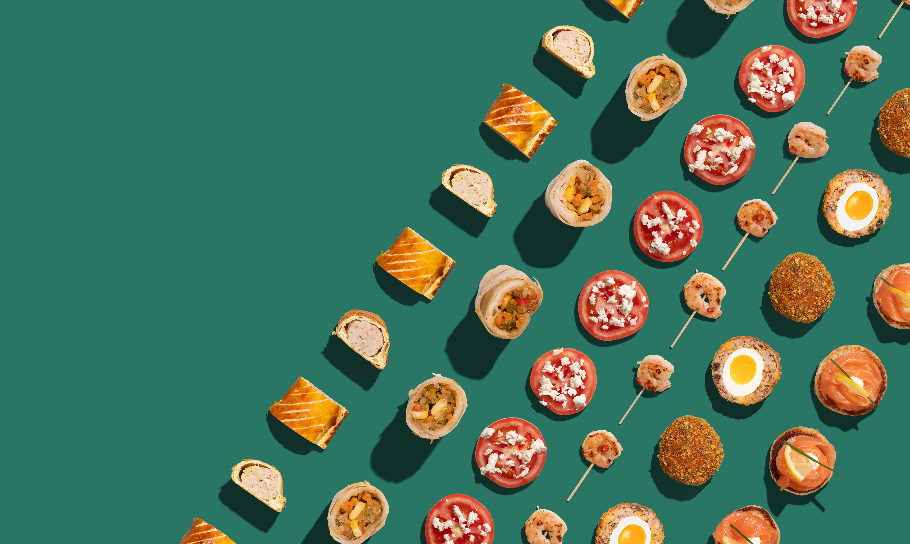
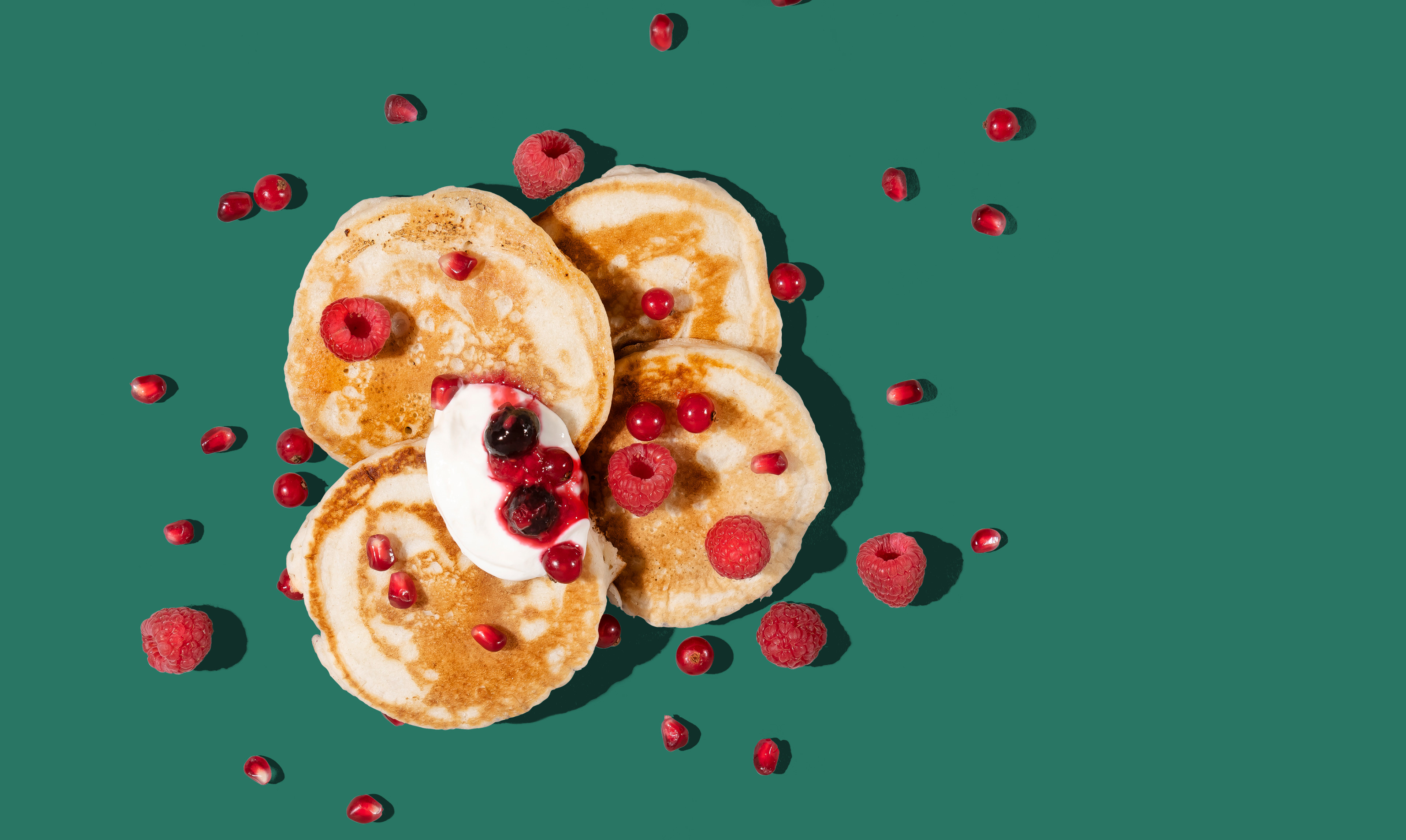
The photography was directed to show fresh food in a graphic sunny way. Strong shadows and colourful backgrounds make the food stand out in the cluttered lunch-time market.

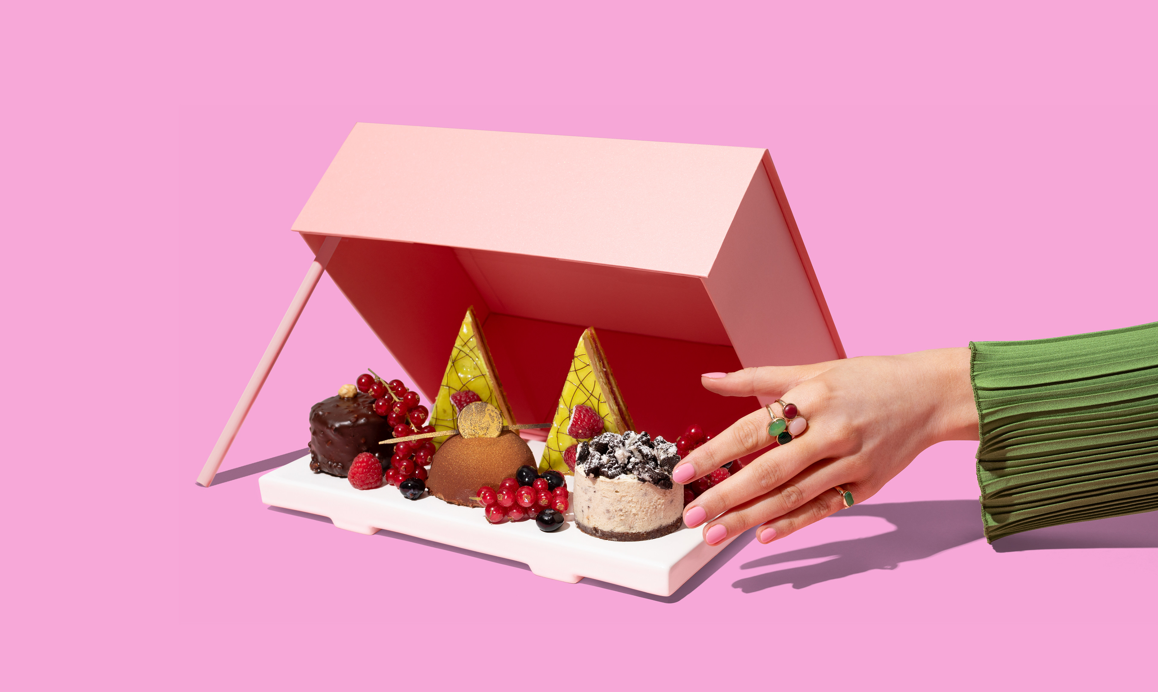
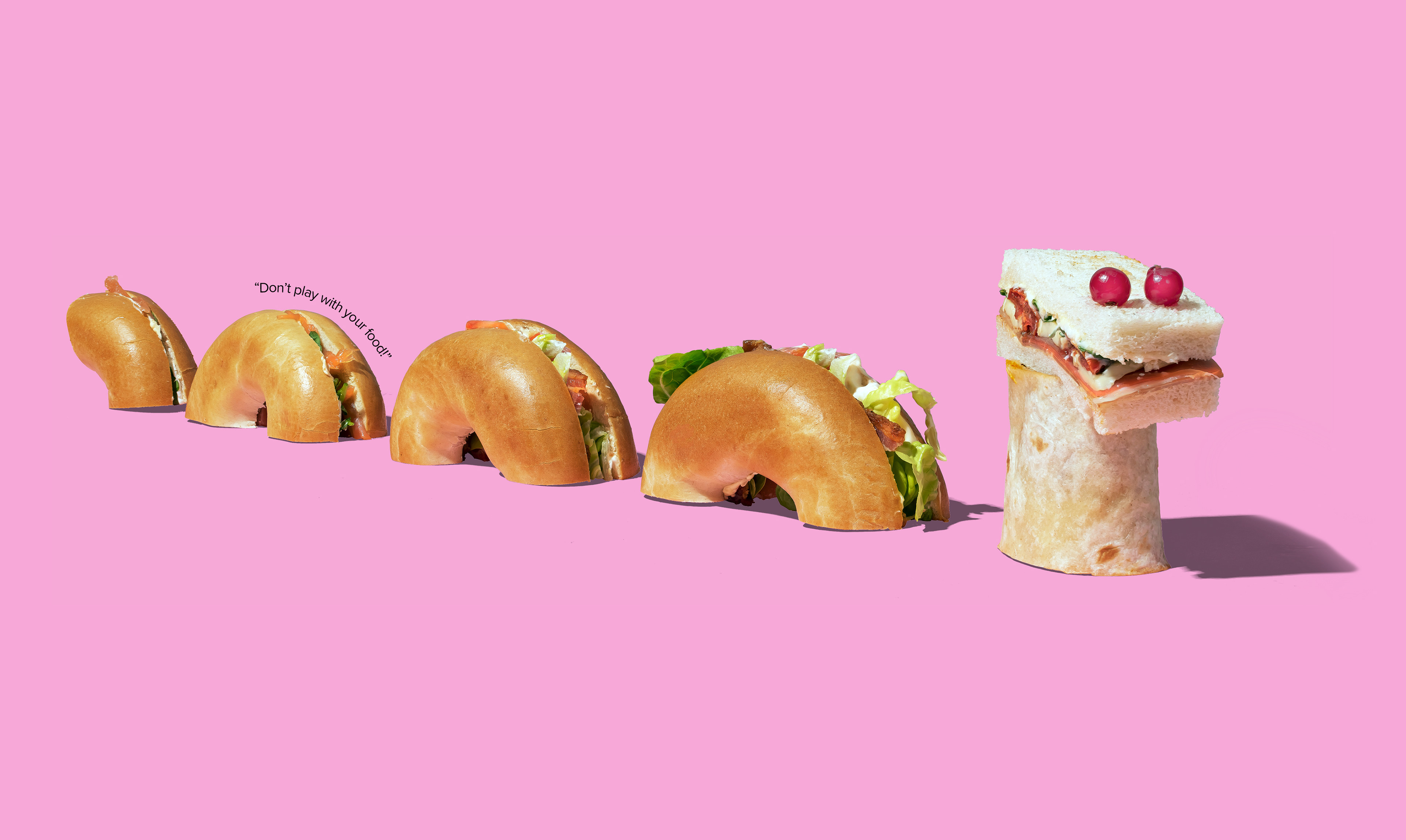
Take away packaging and window graphics were designed to stand out and become iconic within the business environments the cafes are located. Within the designs are some 'surprise and delight' easter eggs.